Museum of London, London, United Kingdom
Architects
Jean-François Milou, principal architect
Thomas Rouyrre, design lead
Trung Thanh Nguyen, project manager
Luc maes, project team member
Camille, project team member
Shinobu Takaso, project team member
Client
Museum of London
Area
25,800sqm
Budget
USD200,000,000
Consultancy Service scope
Concept Design
Bidding mode
Competition
The City as a Museum
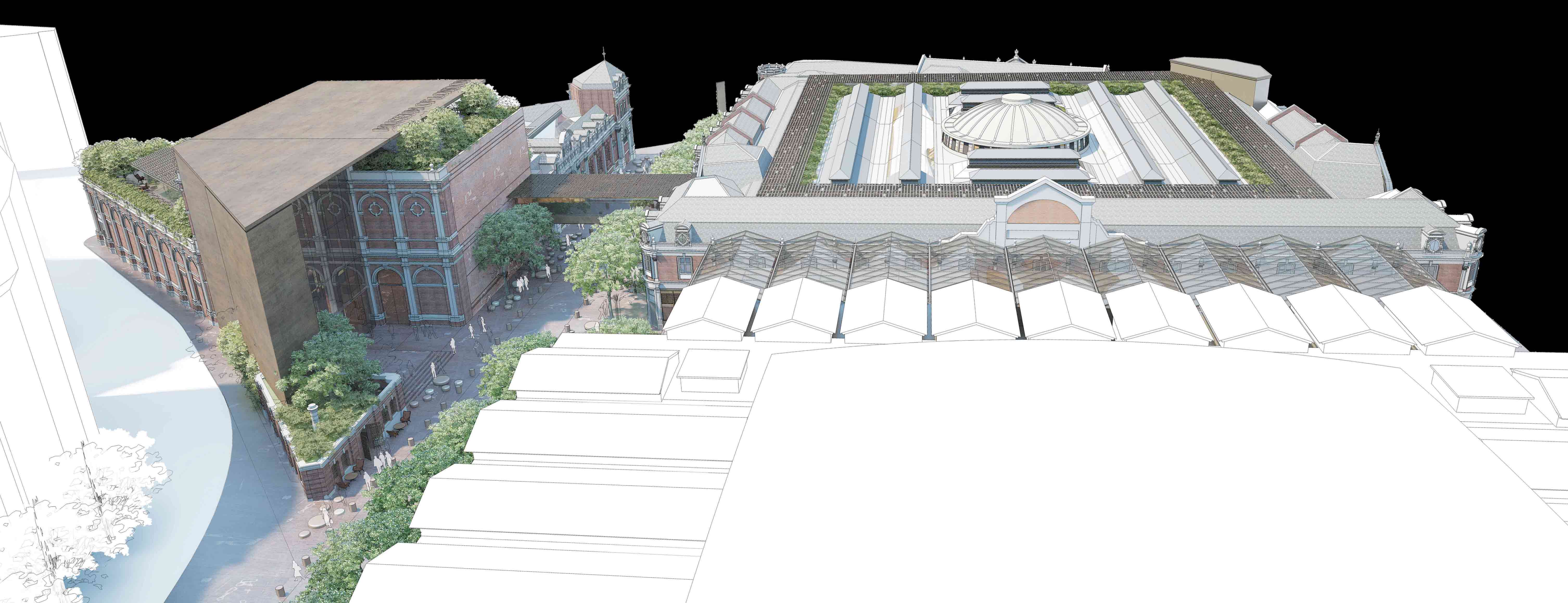
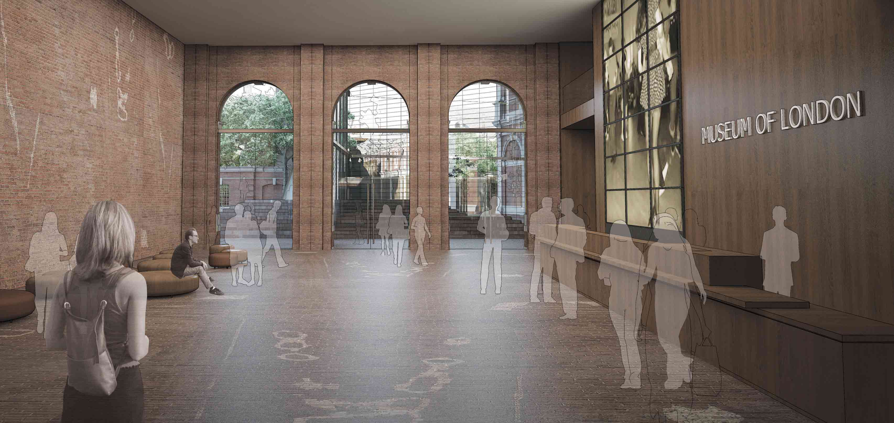
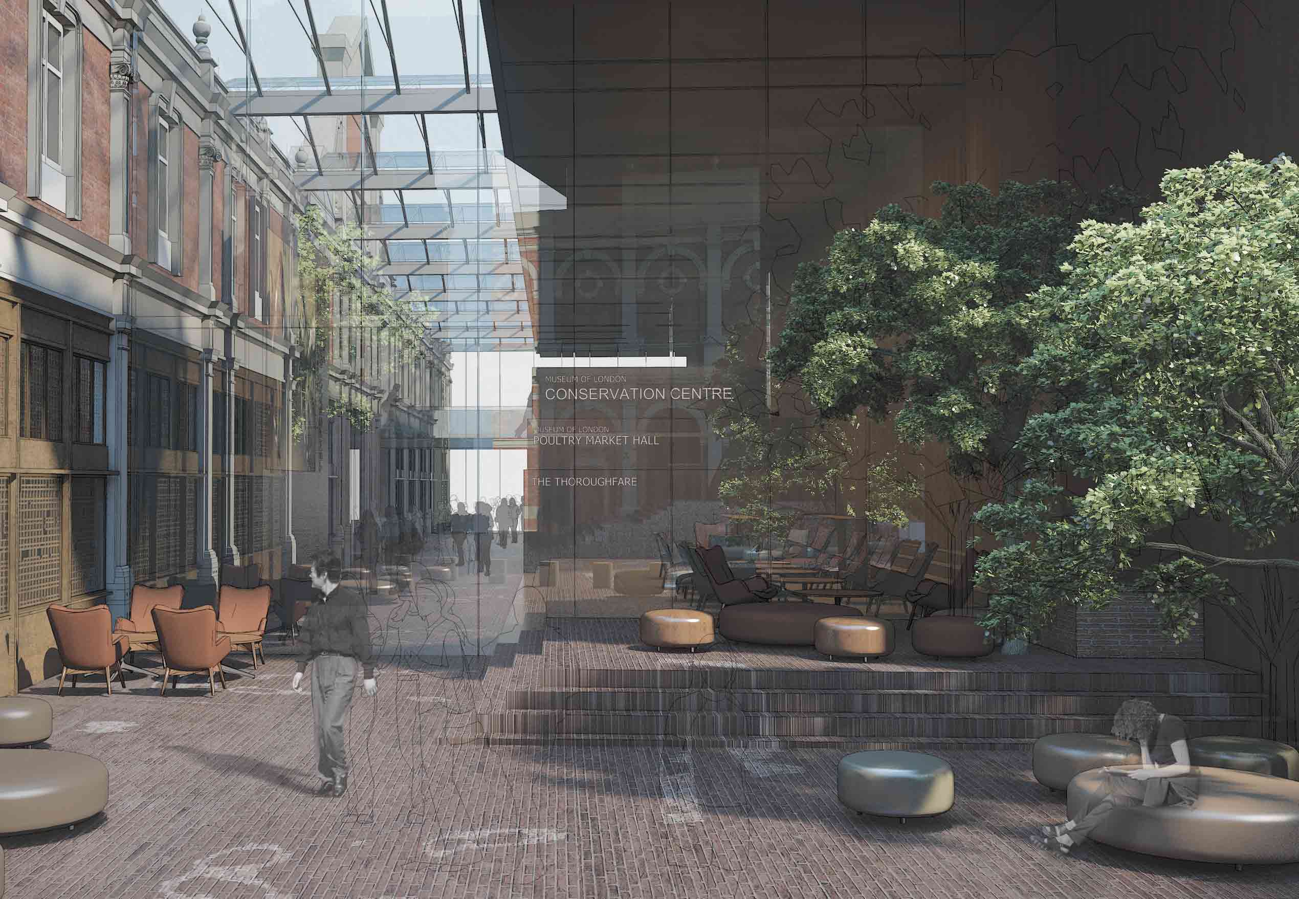
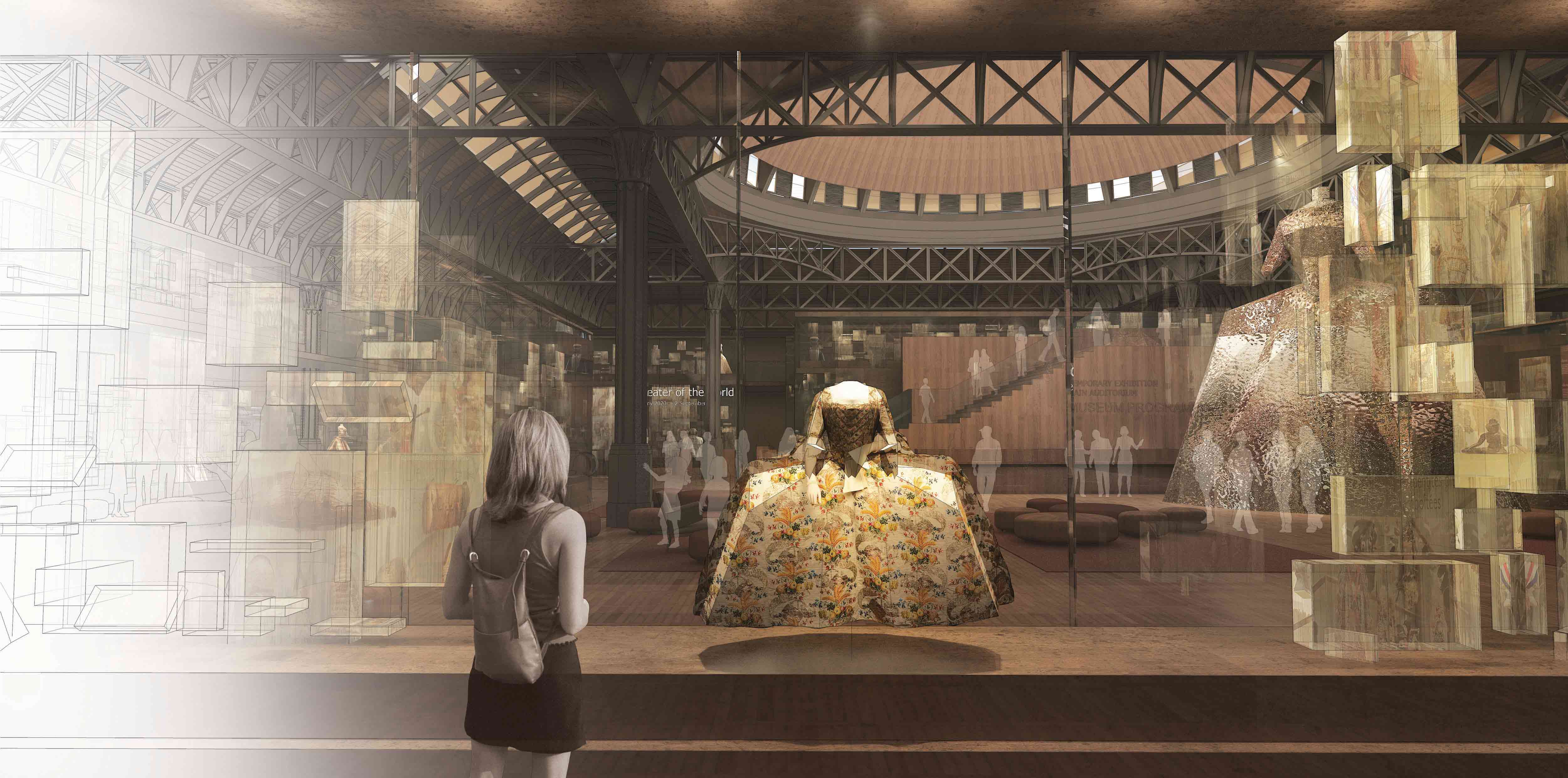
The new entrance to the Museum of London is designed like a giant showcase enveloping the Red House and Engine House buildings, announcing the ambitions of the new Museum – to be on the scale of the surrounding city, to merge seamlessly with the historic fabric of the site and surrounding cityscape, and to offer a stunning opening onto the layered collections and intercepting stories inside the Museum that bear witness to London’s past and draw visitors on from the present towards the future. It leads visitors into the new Museum of London, where the collections are displayed in spectacular and dramatic fashion.
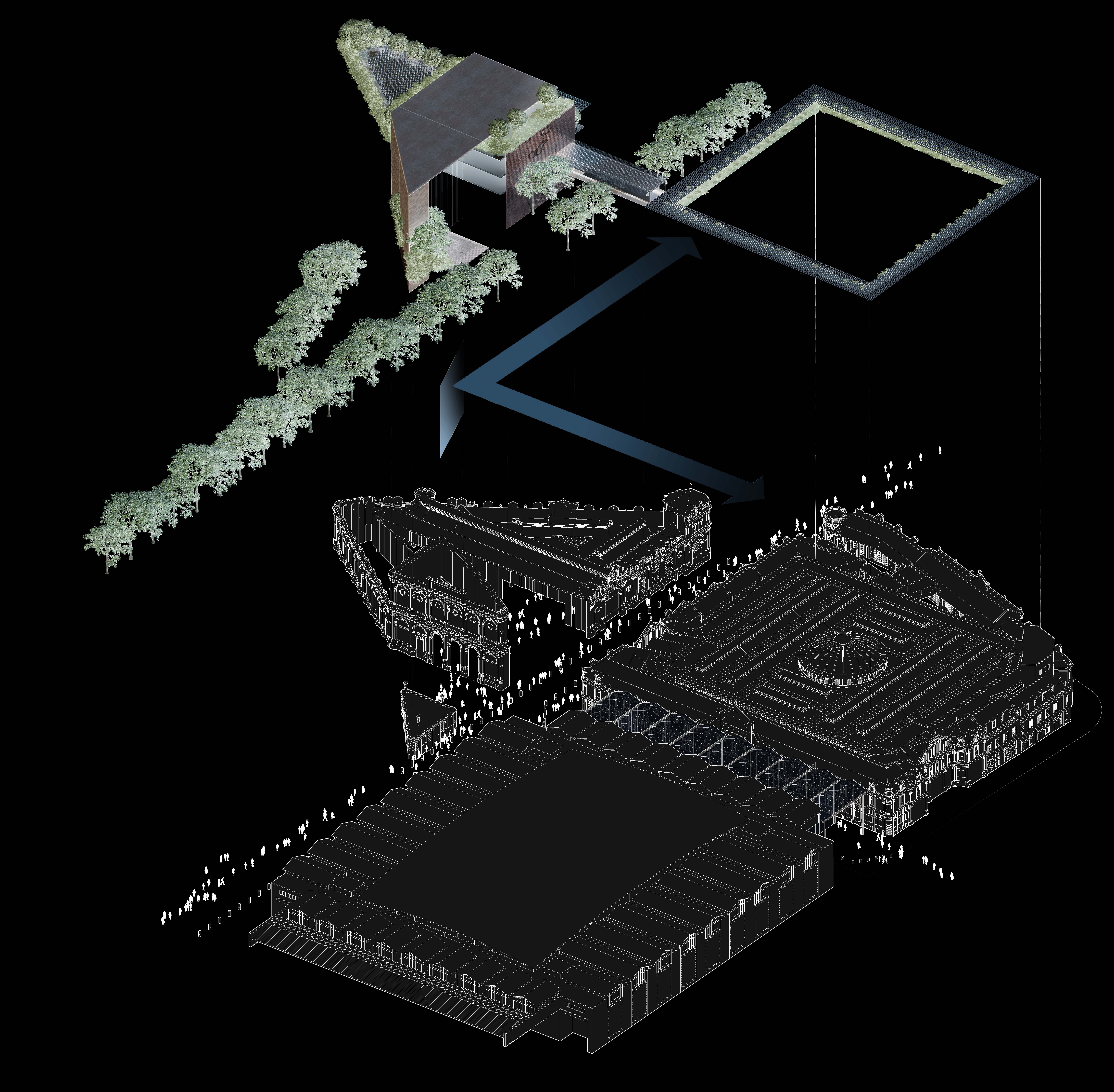
Above all, it stages the Red House, the Engine House, the General Market and the Fish Market in a new and unexpected way, making them appear as major objects from the Museum collection. The project is committed to the exemplary restoration of all the architectural heritage on the site.
The only new element added to this historical landscape is the spectacular new entrance to the new Museum, enveloping the existing Red House and Engine House buildings to create the new main entrance space. This new entrance is at once a museographic presentation of the two former industrial buildings, a monumental showcase inviting in the public, and a beautifully crafted work of patinated metal, glass and stone.
The materials, the design, and every aspect of the new entrance conjure up the idea of a sculptural work that defies easy classification, being at once reminiscent of historical tonalities yet entirely contemporary in its proportions and its forms. Its spectacular finishing in bronze-coloured stone, its elements of dark wood and gold, and its anti-reflective glass give visitors to the new Museum of London a taste of the treasures to be found within.
The Museum as a City
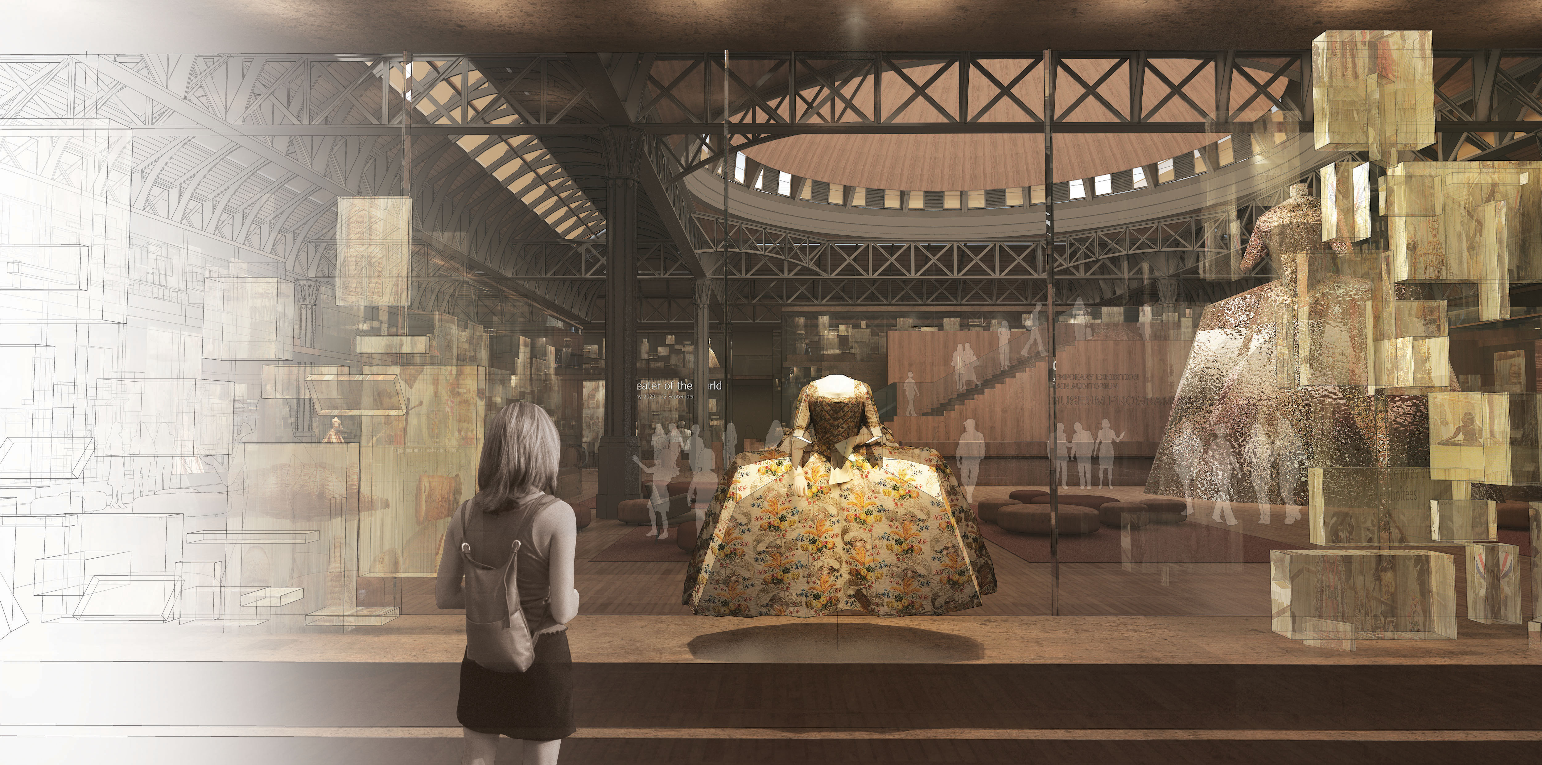
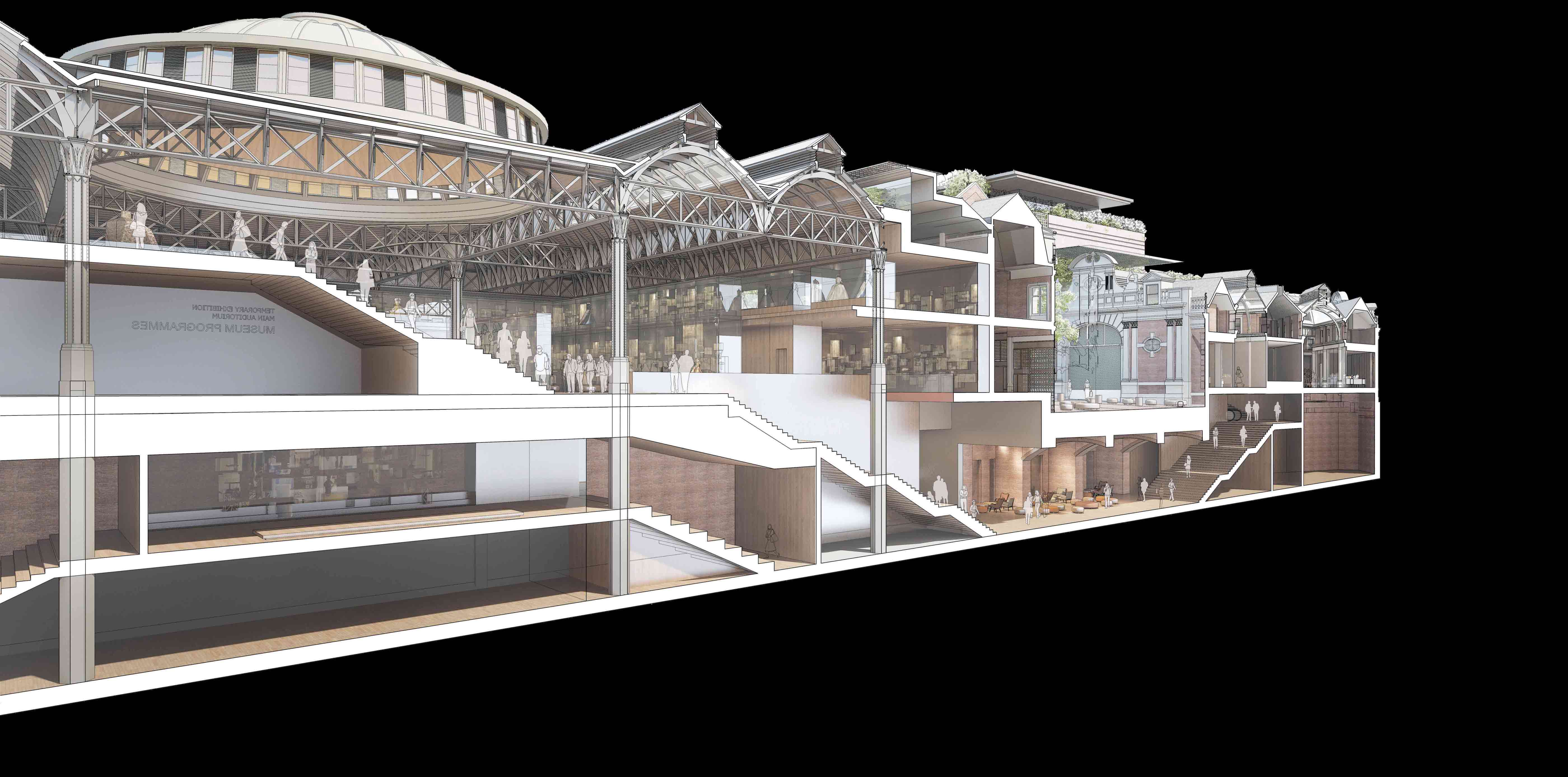
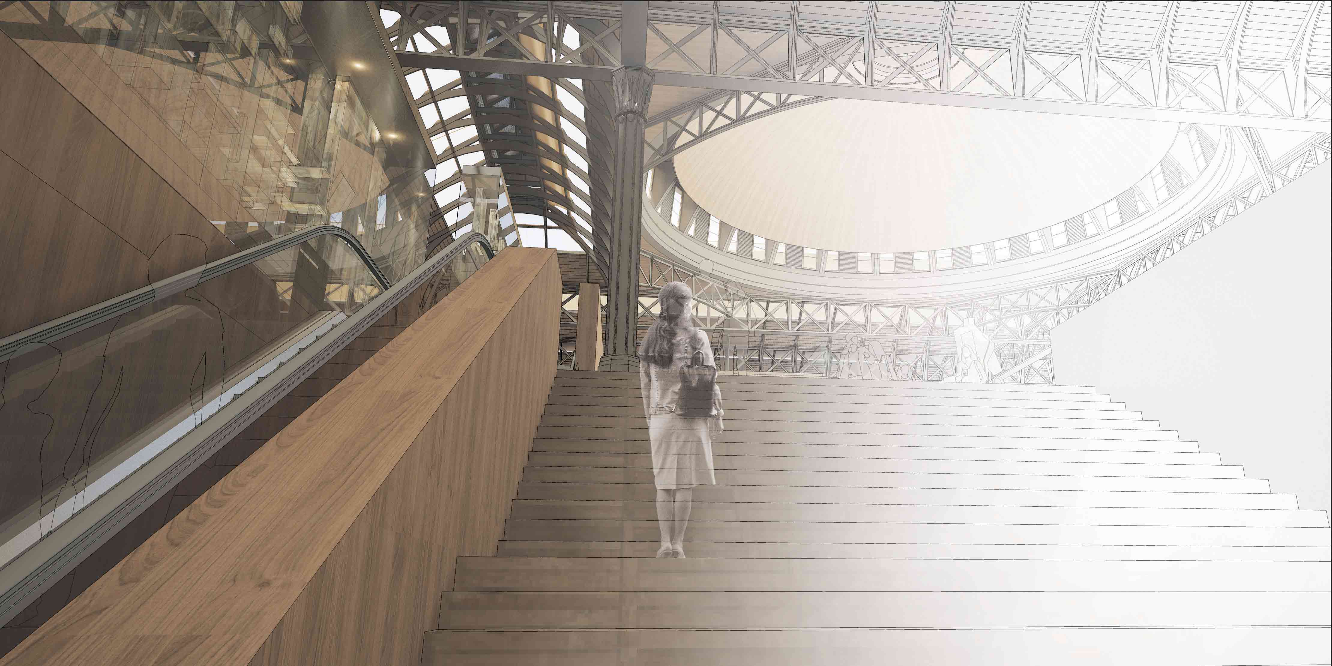
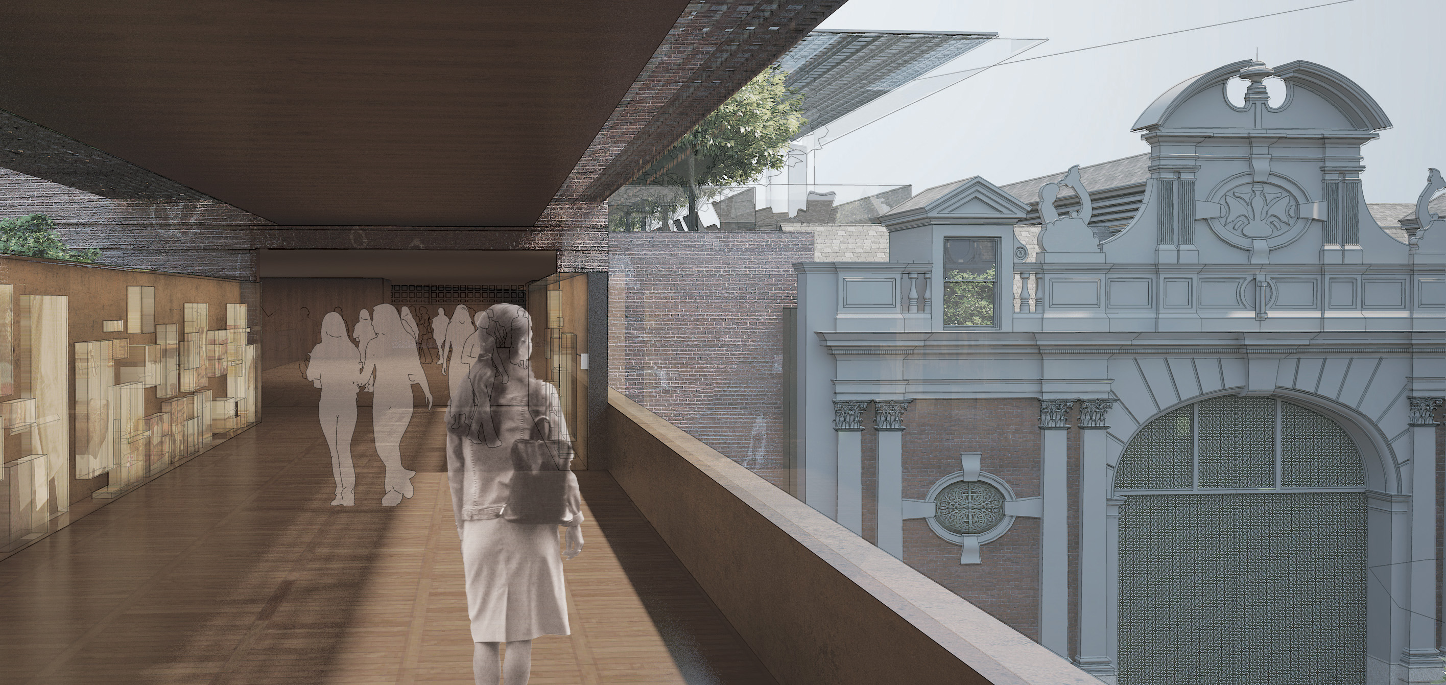
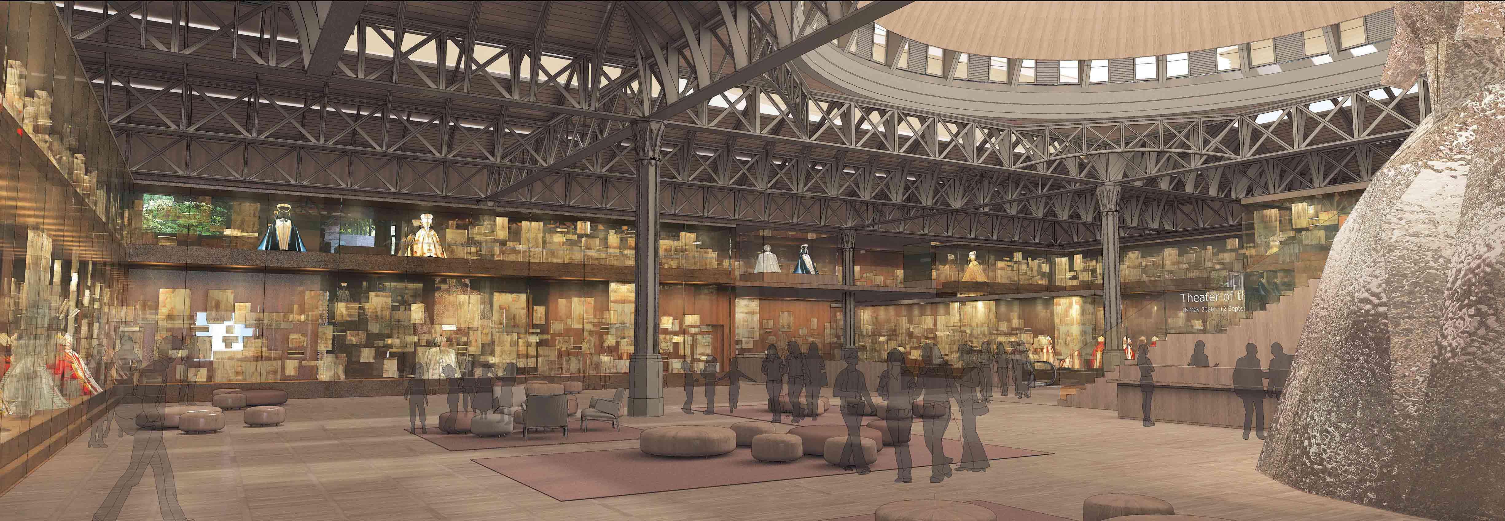
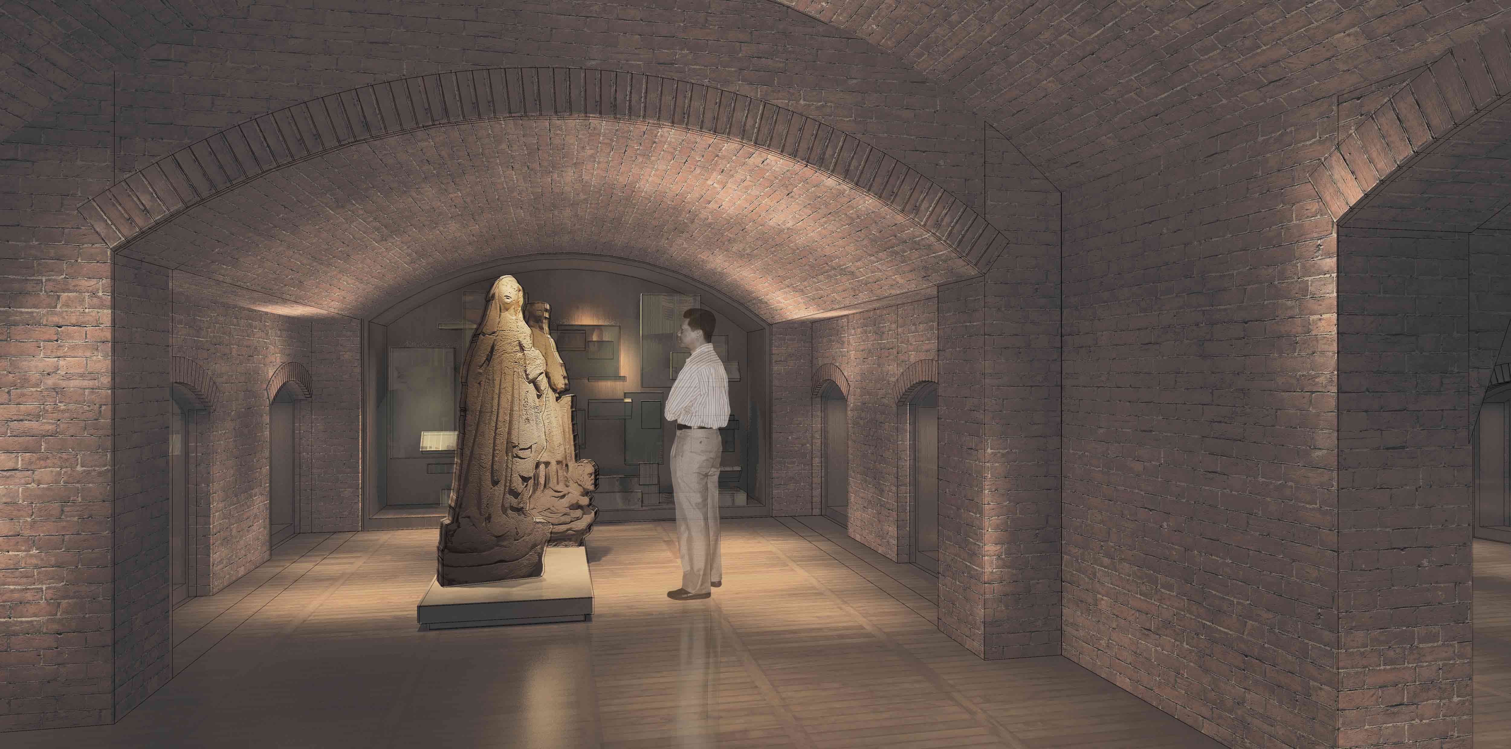
Visitors enter the Red House, descend into the entrails of the city, come upon the railway line that passes through the foundations and then discover the General Market from the perspective of a staircase that leads into the space beneath the dome. The Museum’s collections, presented like treasure in a crown of showcases around the space, surge up in front of visitors before they make their way across a sky-bridge above West Smithfield Avenue to the spaces of the Fish Market with their cafes and shops.
Inside the Museum, large showcases present the collection as an accumulation of stories and experiences, a treasure trove of objects flowing from the city’s earliest history to its present. These showcases are made of the same materials of patinated metal, dark wood and gold, and anti-reflective glass as the new entrance enveloping the Red House building. Visitors are thus invited on an enchanted promenade in which elements familiar to their imaginations – the buildings, the interior spaces of the Markets, the collections of the Museum – appear before them in an unexpected, surreal, dramatic way.
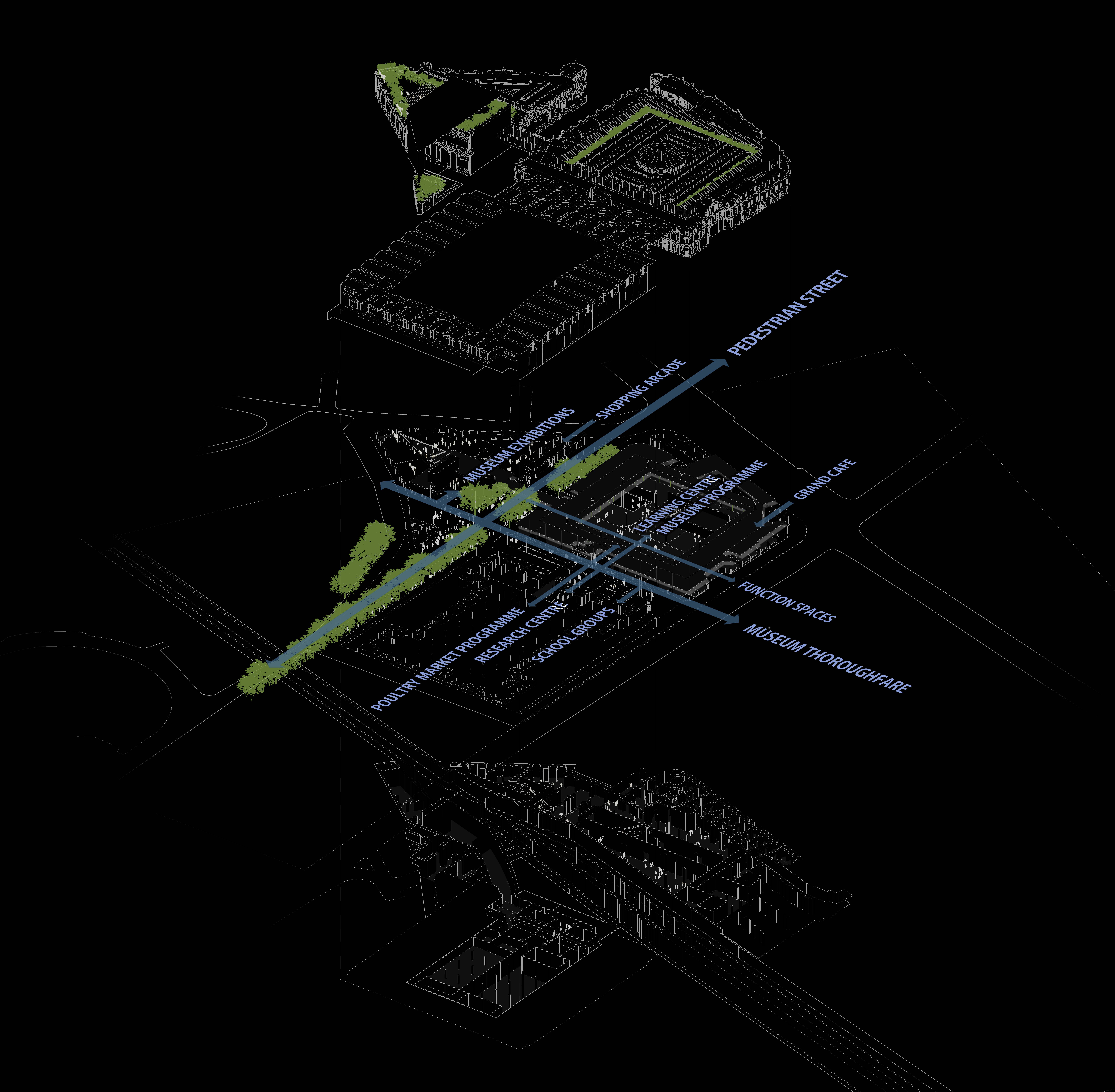
It is only slowly that the collections are discovered in more intimate fashion on this promenade through 8,000 m2 of exhibition space. Like a city, the Museum invites visitors to take different routes. The routes for first-time and repeat visitors are shown within. Other routes through the Museum are of course possible, including from the Farringdon Street entrance for pedestrians coming from the new Farringdon Station or from the Museum Thoroughfare for repeat visitors.
Urban Functioning and Landscaping
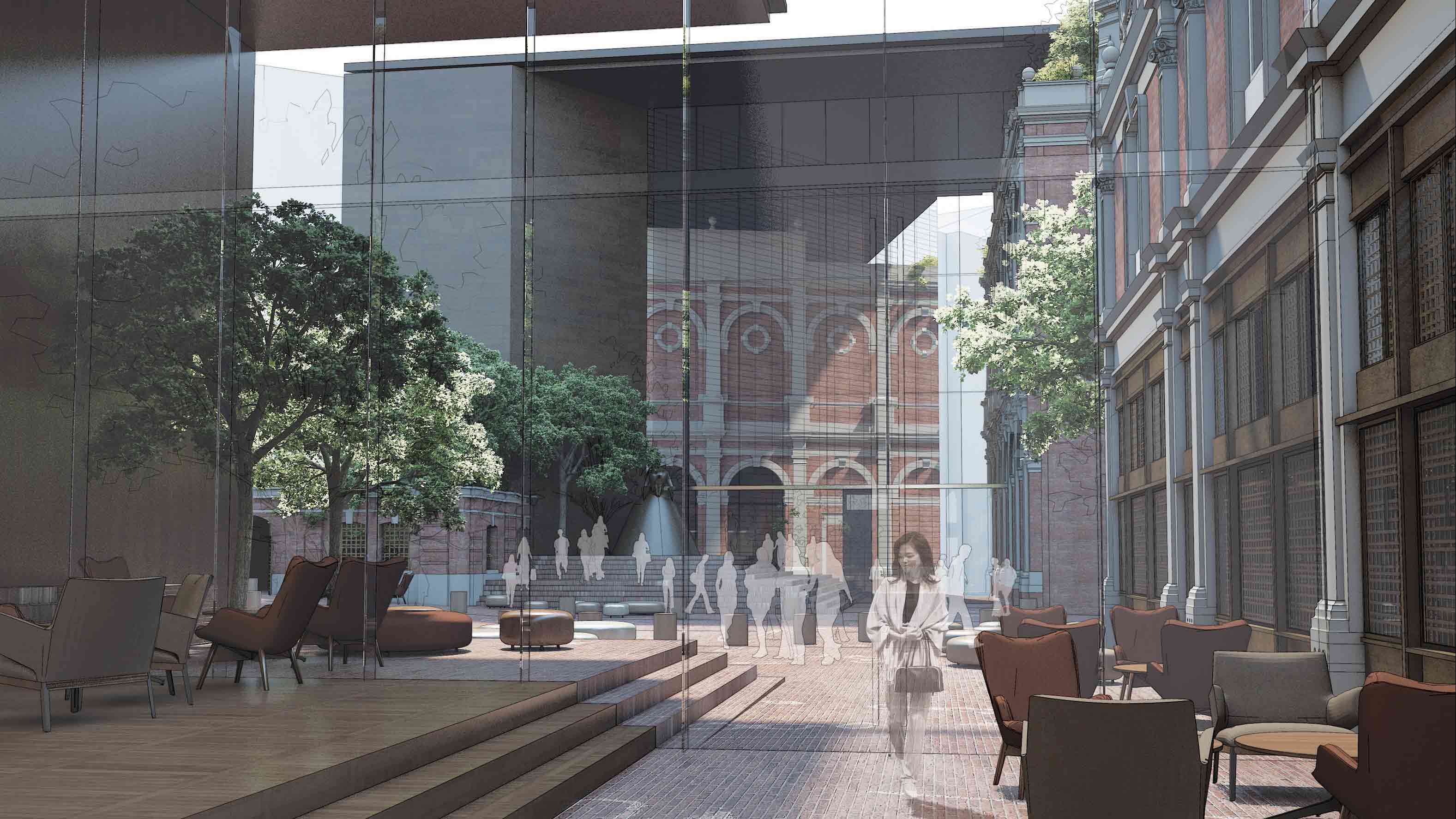
The new entrance building contains a giant urban mirror oriented at 45º and reflecting the façade of the Red House onto the Museum Thoroughfare. In reverse fashion, this urban mirror brings the reflection of the Museum Thoroughfare into the entrance space of the new Museum. The new entrance thus functions like an optical prism connecting the spaces of the city together.
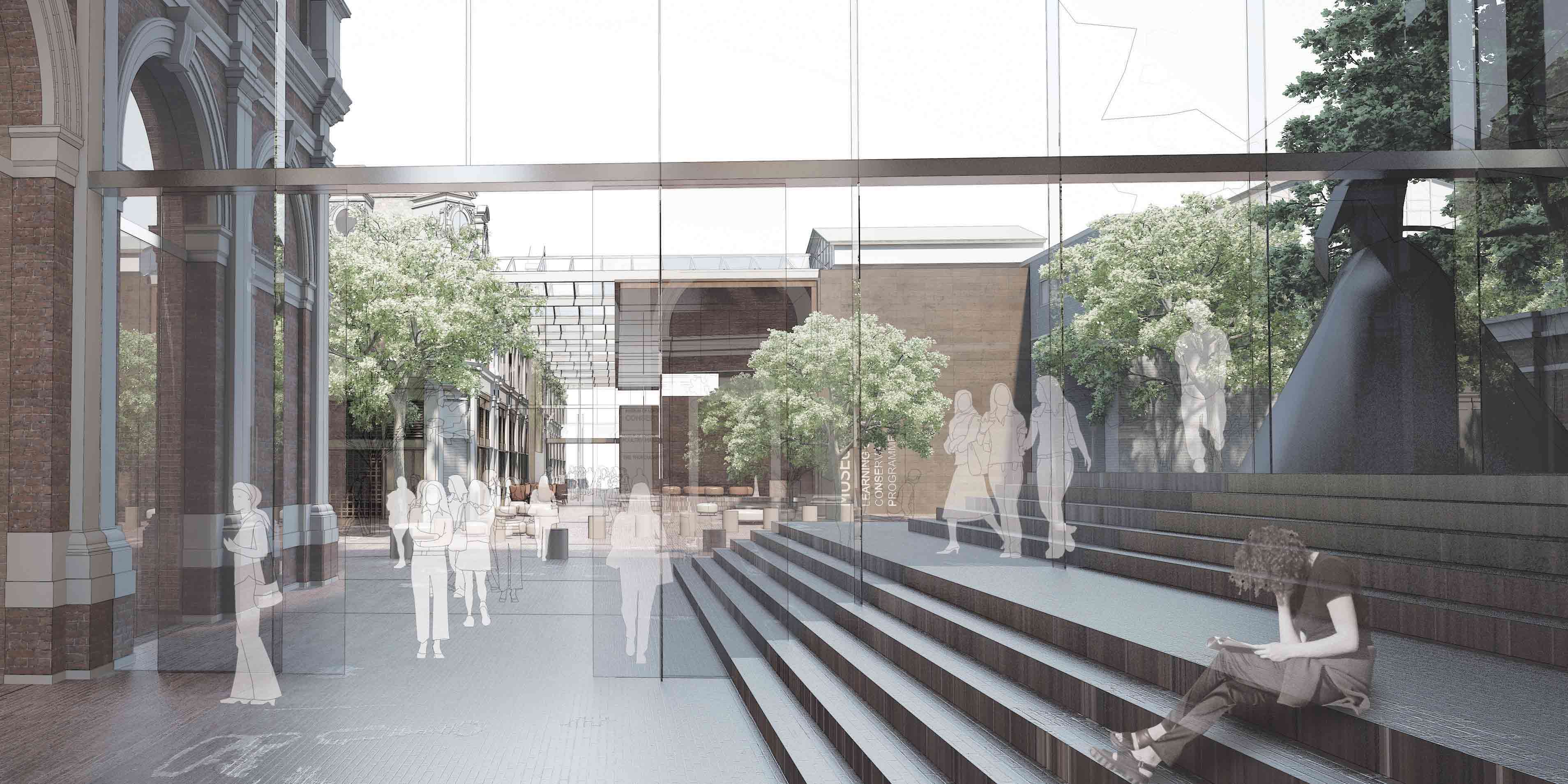
By activating West Smithfield Avenue and Poultry Market Avenue as pedestrian spaces, the design turns the new Museum entrance into the heart of an animated, bustling new urban quarter. Limiting the circulation on West Smithfield Avenue around the General Market and the Fish Market will allow new pedestrian areas to be formed, and the creation of the new Museum Thoroughfare on Poultry Market Avenue will provide lively pedestrian space that is open both by day and by night.
The circulation to the east and west on West Smithfield Avenue and Smithfield Street will provide the drop-off points necessary for the optimal functioning of the new Museum. Importantly, the entrance on the corner of the General Market and Farringdon Street will be open and welcoming to pedestrians coming from Farringdon Station and the new transport hubs in the area. This historic entrance to the General Market will serve the Museum’s large interior café, attracting pedestrians, commuters leaving work, or casual passers-by and becoming a key meeting place and facilitating rapid access to all the activities of the Museum.
The beautiful historic façade on Farringdon Street will be animated by large glass showcases providing pedestrians and passing traffic evolving and spectacularly conceived representations of the great periods and major figures in the history of London, as well as contemporary exhibitions and events.
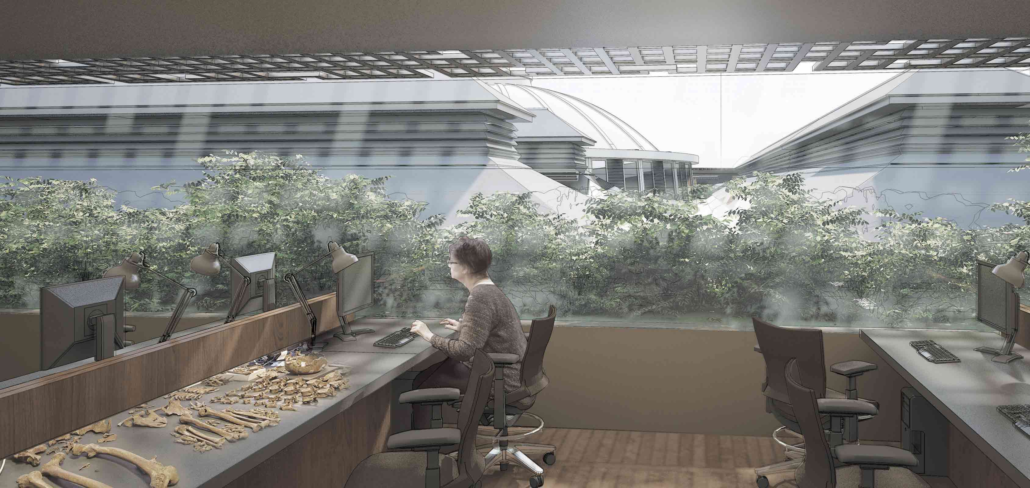
The roofs of the Red House and Engine House and the façade on Westfield Street are planted with tall shrubs that seem to rise up as if on an ancient archaeological site. West Smithfield itself is treated like a pedestrian area, with groups of trees at intervals giving the street a peaceful and refreshing character.
An Exemplary Restoration at Ease with the Past, the Present and the Future
By conserving all the existing heritage within the project area, the new Museum of London will take a highly symbolic step in line with the urban context and expectations of Londoners. The design restores, enhances, and presents the architectural heritage of the existing buildings in work that is uncompromising, exemplary in character, and accommodating of present and future functions.
It avoids stark architectural gestures, privileging complementarity over contrast. It opens up a dialogue between the Museum’s collections and programmes of all kinds, with spaces designed to cater for evolving displays and needs, a multiplicity of events and further growth.
Competition

